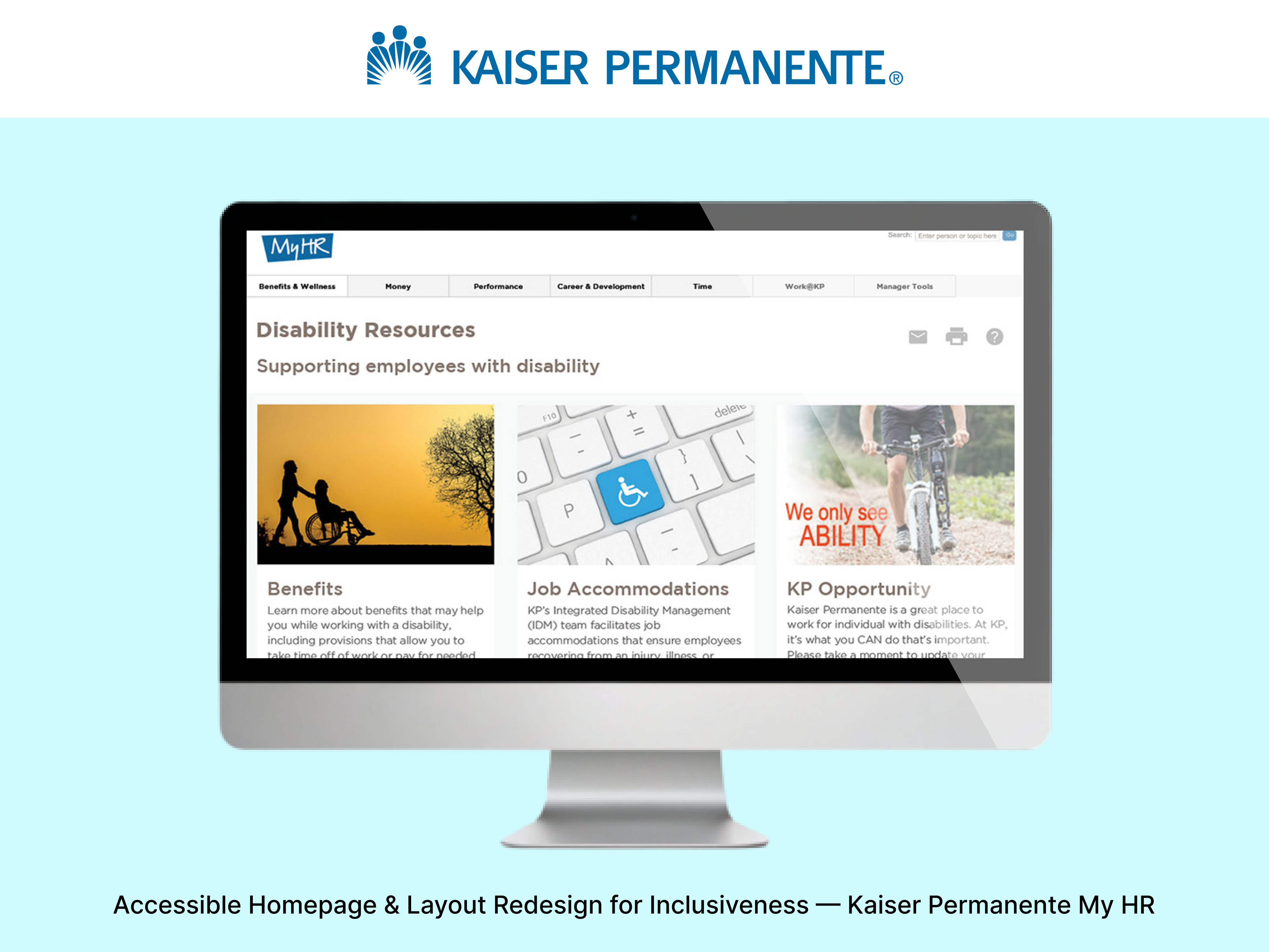
Designed the My HR Kaiser Permanente portal serving over 50,000 employees, including a homepage redesign, accessible layout catalog, style guide, pattern library, and Total Health Incentive Plan UI enhancements.
Role: Lead Visual/UI Designer
Year: 2016 - 2019
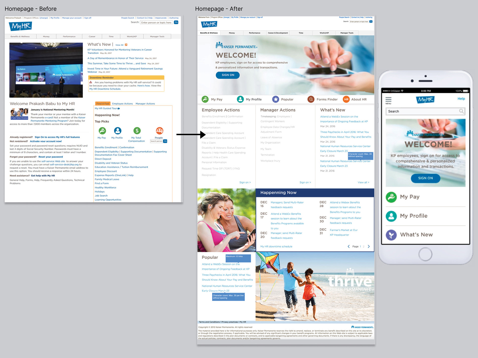
Homepage Redesign
As the lead designer, I began the process by conducting user research and facilitating a workshop with stakeholders and real users to understand their workflows, pain points, needs, and goals. We discovered that the previous homepage was cluttered, difficult to navigate, and inconsistent with the Kaiser Permanente Digital Style Guide. Using insights from interviews and workshop sessions, my team and I redesigned and launched a new homepage that organizes information into clear categories, enhances accessibility for people with disabilities, and provides a more visually appealing, user-friendly experience.
Designing Inclusive Layouts: Building the My HR Accessibility Catalog
My team and I developed ten layouts for various content categories within the My HR portal, ensuring each design complied with the latest WCAG accessibility standards and was fully compatible with screen readers. We created a comprehensive layout catalog and detailed design specifications for developers and stakeholders. The catalog was later presented to other internal Kaiser Permanente teams to help them determine which layouts best suited their content and communication needs.
I collaborated closely with the information architect, content strategist, and multiple web developers to achieve a successful and inclusive launch.
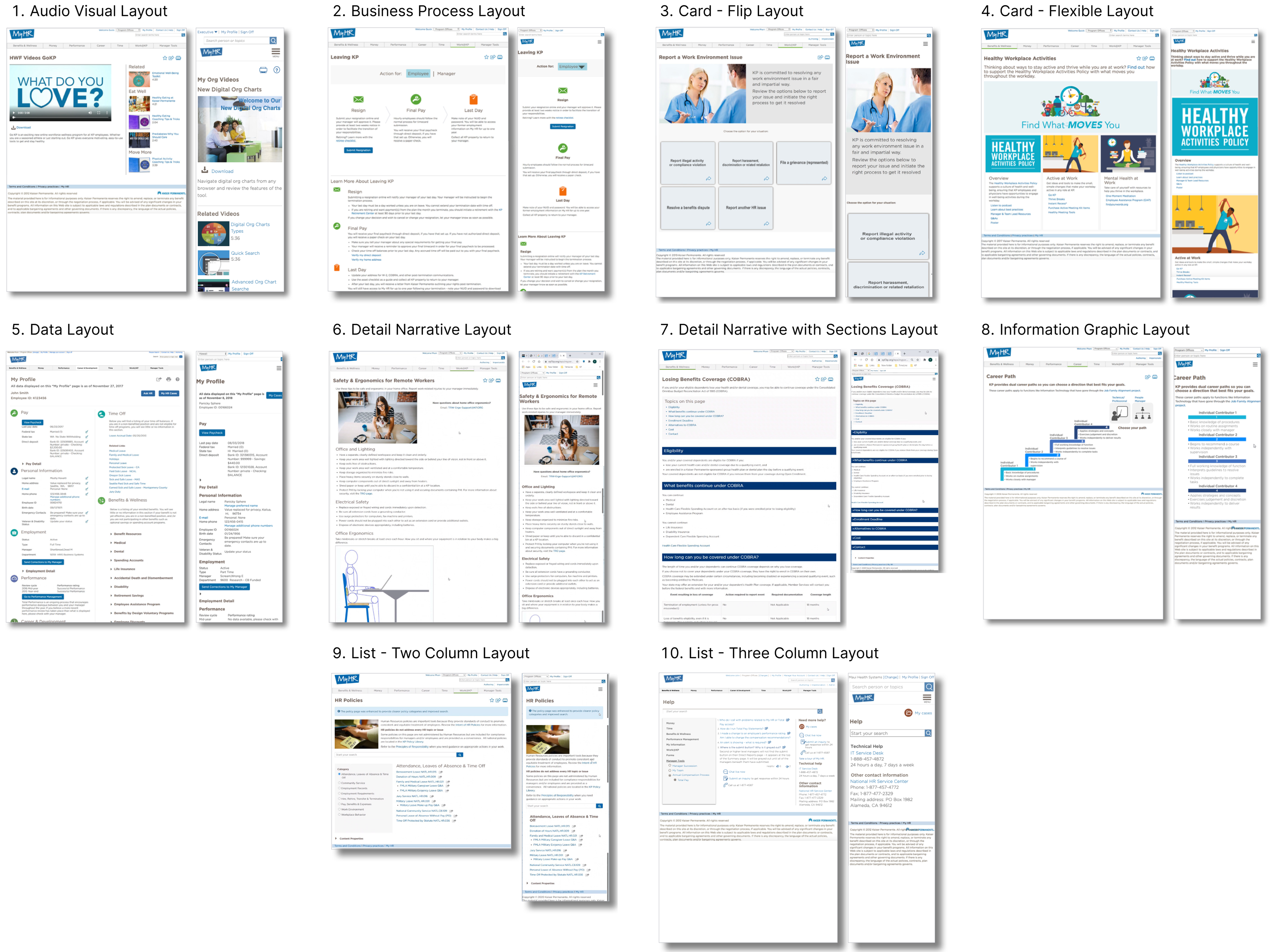
Inclusive Layouts
I began the process by interviewing key stakeholders who frequently used the layouts and conducting an audit of the existing designs. Based on these insights, I created wireframes to facilitate discussions and guide decision-making.
Below is an example of one layout — the Audio-Visual Layout — which demonstrates how accessibility was achieved through clearly defined headline hierarchy and strong color contrast.
Once the layout designs were finalized, we launched the catalog for stakeholders, outlining all required and optional elements and rules such as character counts, image sizes, and spacing. The stakeholder catalog was designed specifically for non-technical audiences, focusing on content and interaction design guidelines rather than development specifications. This approach ensured clarity, consistency, and accessibility across teams.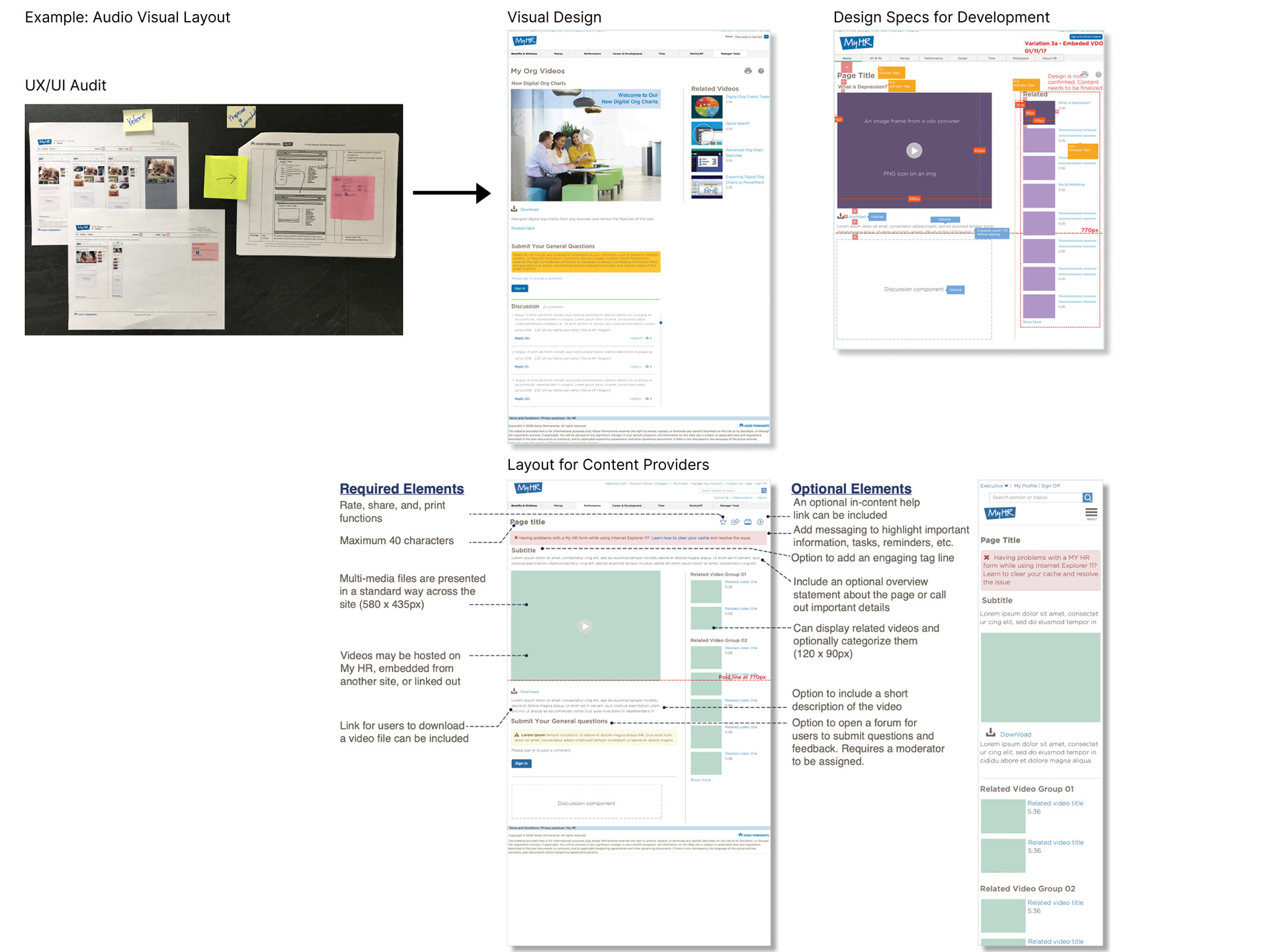
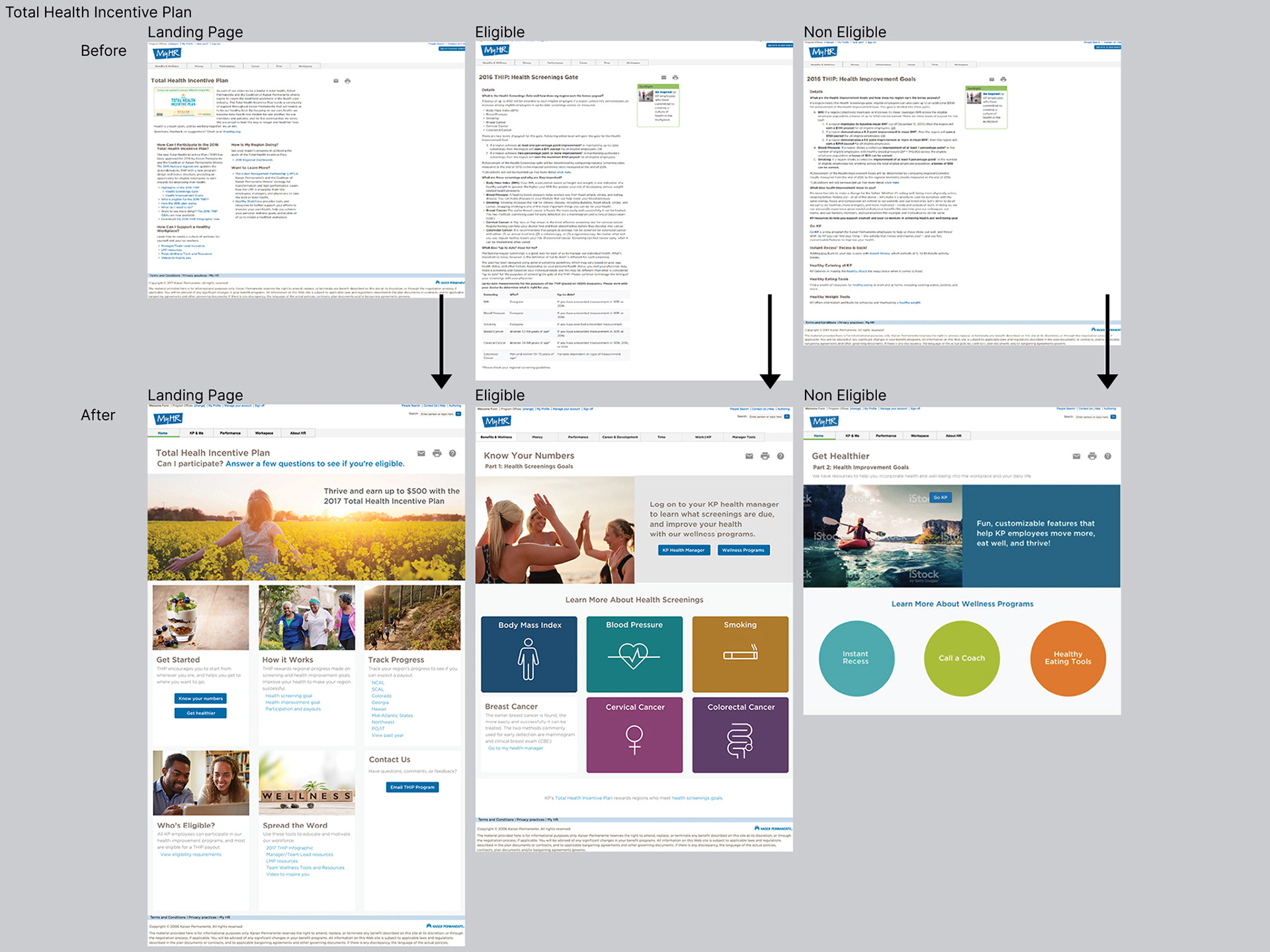
Total Health Incentive Plan UI & UX Redesign
The Total Health Incentive Plan is an annual Kaiser Permanente program that offers employees up to $500 for demonstrating measurable health improvements through program screenings such as quitting smoking or achieving a balanced body mass index.The
Through user feedback, the team learned that the previous layout lacked visual appeal, contained excessive text, and provided a poor user experience. As the lead designer, I introduced an accessible flip card layout that used storytelling imagery to highlight the benefits of a healthier lifestyle. Each card invited interaction by encouraging users to click and explore content, paired with bold and lively color schemes to boost engagement.
Within the first month of launch, participation in the program increased by 15%.
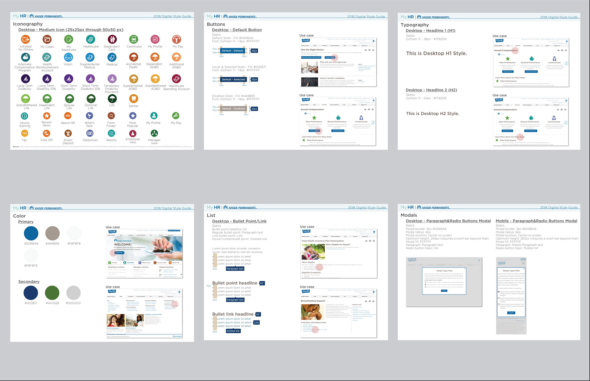
Style Guide Creation
I I collaborated with developers to create the My HR Style Guide, reflecting the latest Kaiser Permanente br.and identity—bold, bright, and modern. The guide serves as a key reference for both designers and developers, ensuring visual and functional consistency across platforms. We produced comprehensive versions for both desktop and mobile. Below are examples from the full deliverable.